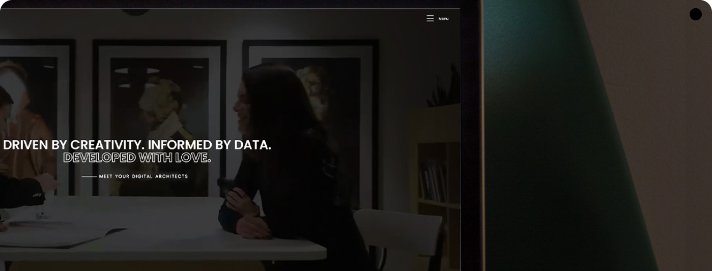
Work That Works.
Intentional design that elevates every touchpoint, from pixels to print.

Leadership MetroWest
Brand Identity Refresh
Elevating a legacy leadership brand through modern design clarity.

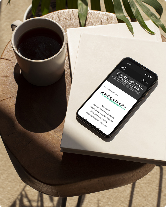
Unity Vault
SAAS BRAND IDENTITY & UI DESIGN
Designing intuitive Brand Identity and SaaS interface for caregiving partners.
Fik-Shun Stegall
Creator Branding & Digital Assets
Crafting digital assets that elevate the Fik-Shun Patreon presence.
ALX Creativest
Marketing Agency Design & Visuals
Shaping engaging digital experiences.
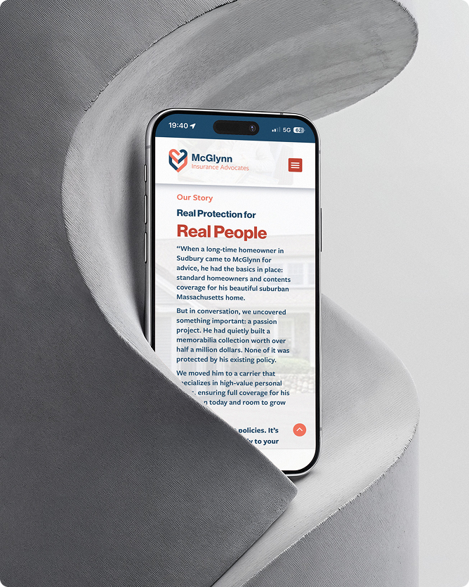
McGlynn Insurance Advocates
Brand Identity Refresh
Bringing a century-old insurance brand confidently into the 21st century.

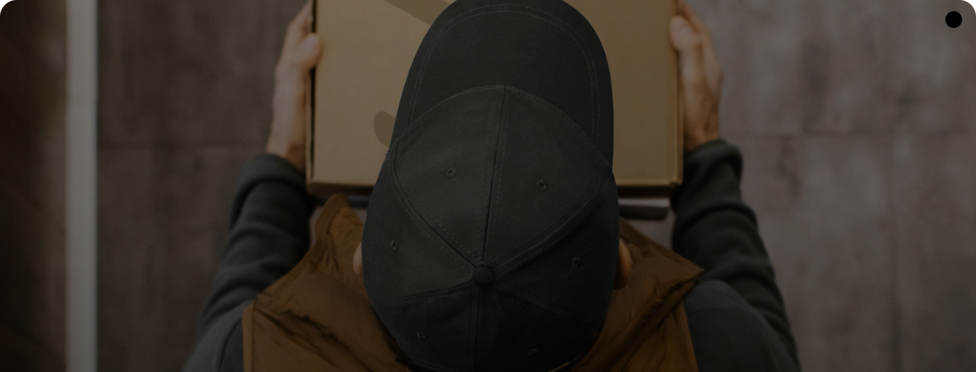
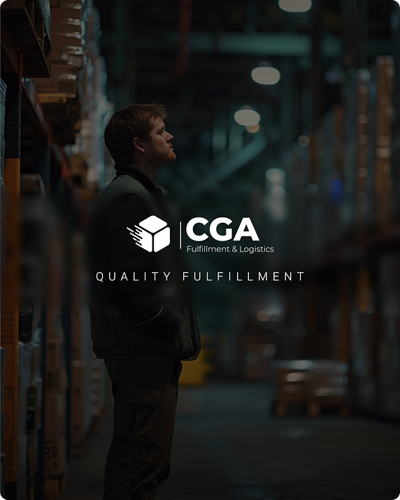
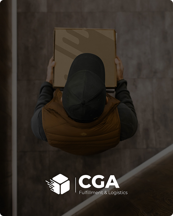
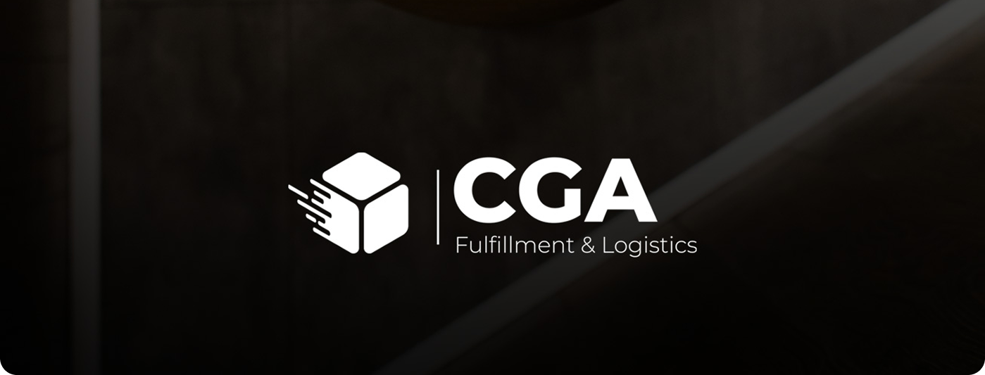
CGA Fulfillment & Logistics
Brand Identity, Packaging & Visual Direction
Renewing the CGA brand with elevated identity and packaging design.


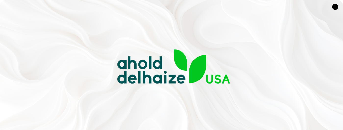
Ahold Delhaize
Brand Collateral design
Creating unified visuals for the DEIB Immersion summit.

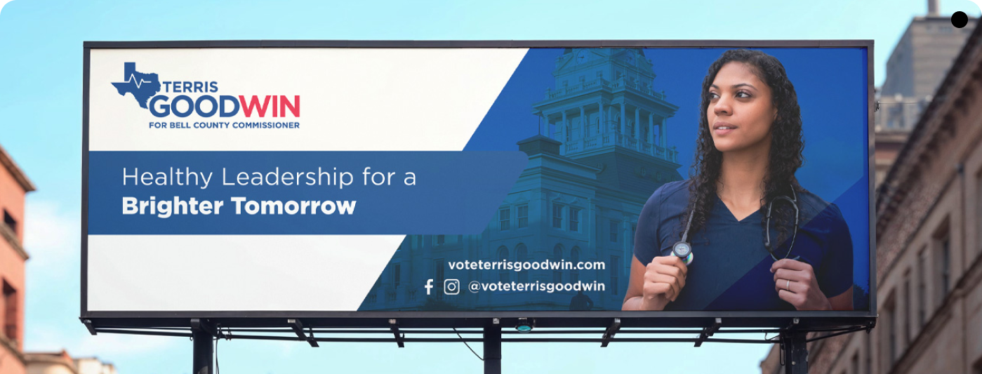
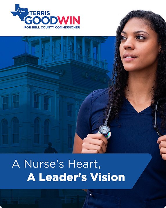
Terris Goodwin
Campaign Billboards design
Launching bold, attention-grabbing visuals for the Bell County Commissioner election.
Have a project in mind?
I collaborate with brands and agencies seeking thoughtful, strategic design solutions.
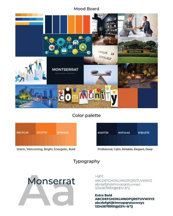
The Invitation to Elevate a Legacy
Leadership MetroWest approached me with a clear ambition, to evolve their visual identity into something that reflected the depth, professionalism, and regional impact of their work. Their existing brand carried history and recognition, but it lacked the clarity, cohesion, and contemporary presence required to represent an organization shaping the future of leadership in the MetroWest community.

Heart of the Organization
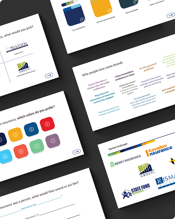
Before touching design, I immersed myself in their mission, values, and tone. Leadership MetroWest is built on connection, authenticity, and civic engagement. The identity needed to feel trustworthy, modern and grounded, something that could speak to executives, community leaders, and young professionals alike. Through discovery meetings and visual audits, I defined the strategic core: a brand that represents leadership not as authority, but as influence, presence, and integrity.
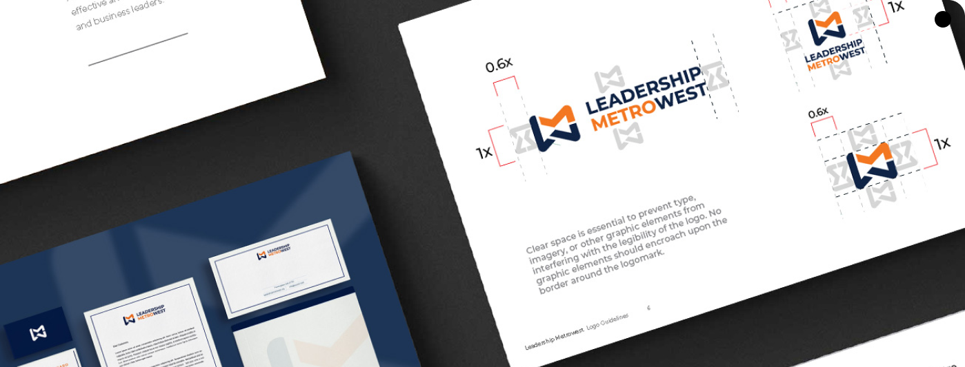
Building a Cohesive Visual Language
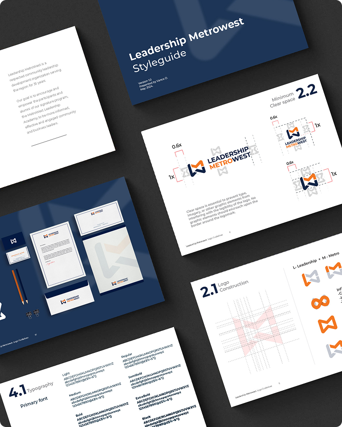
From these insights emerged a refined brand system that strengthens their voice across every touchpoint.A modernized logo, an intentionally chosen typography palette, and a sophisticated, regionally inspired color system created a unified visual identity. Each element was designed to project clarity, stability, and invitation, qualities essential to their mission. The new design language ensures consistency across print, digital, and event materials, making the brand instantly recognizable and deeply rooted in purpose.
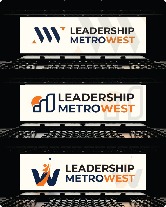
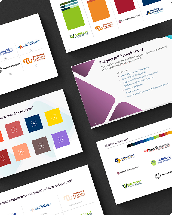
Initial Concepts & Creative Range
I began the process by developing three distinct logo concepts, each offering a different visual interpretation of Leadership MetroWest’s mission and presence. These initial directions explored variations in symbolism, structure, and tone, ranging from abstract leadership motifs to more grounded, community-centered forms. Together, they established a clear creative landscape and set the stage for refinement.
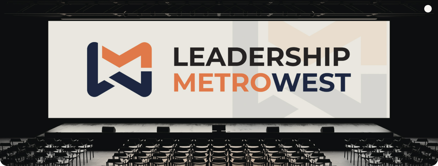
Arriving at the Signature Symbol
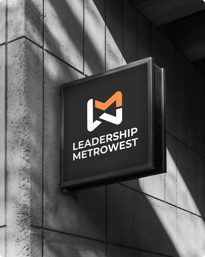
Building on insights from the initial concepts, I developed a fourth, evolved direction, a mark that distilled the organization’s values into a confident, modern symbol. It struck the perfect balance between clarity, purpose, and visual sophistication. The team immediately felt it expressed who they are today, and it ultimately became the foundation of the refreshed identity.

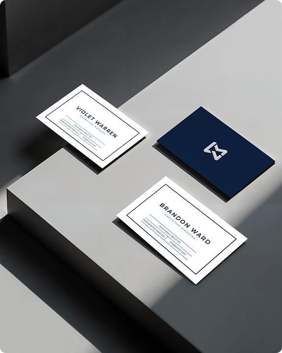
Expanding Into a Full Brand Ecosystem
With the foundation established, I created an extended suite of applications: digital assets, presentation templates, event visuals, marketing collateral, and structured guidelines. Every piece was crafted to deliver a professional, cohesive experience, whether encountered by a first-time participant or a long-time community partner. The result is an identity that not only looks elevated but works effortlessly across every platform Leadership MetroWest touches.
Conclusion
A Modern Identity for a Modern Leadership Community
This project was a collaborative, thoughtful evolution, not a reinvention. The new identity honors Leadership MetroWest’s legacy while giving the organization the clarity and presence it needs for the next chapter. It stands as a testament to the power of intentional design: when strategy meets aesthetics, a brand becomes more than visuals — it becomes an experience.
Like what you see?
Let’s work together.
A Mission Rooted in Care and Connection
When UnityVault reached out, they had a clear founding vision, to simplify caregiving through a secure, user-friendly platform. UnityVault is “your all-in-one solution for organizing, sharing, and managing care responsibilities with confidence. They needed an identity that felt trustworthy and professional, one that mirrored the empathy and structure of the care relationships they were enabling. Through deep discovery, I shaped a brand strategy that centered on security, connection, and harmony.
Defining the Brand Backbone
At the core of the design was the archetype of the Caregiver: compassionate, supportive, and deeply relational. This insight gave us a guiding north star. Together, we built a brand personality around trust and closeness, defining visual tone, verbal tone, and foundational brand values. The strategy grounded the identity in authentic care, allowing me to design not just a product, but an emotional, reliable companion for caregiving partners.
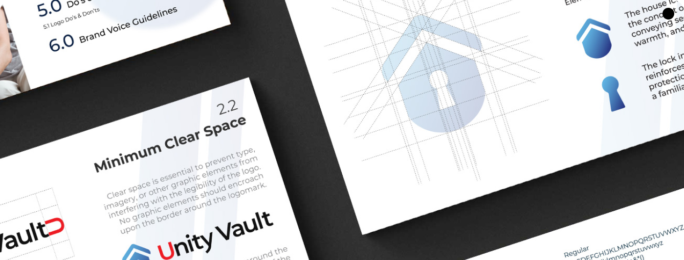
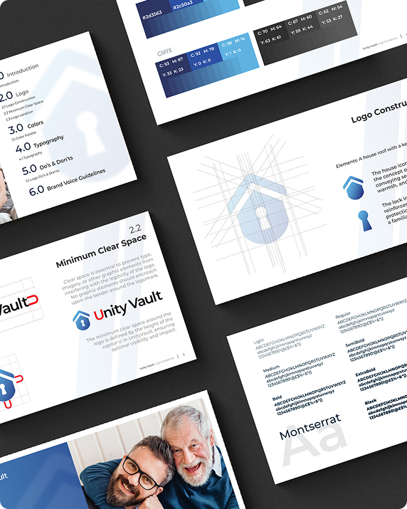
Crafting the Visual Identity
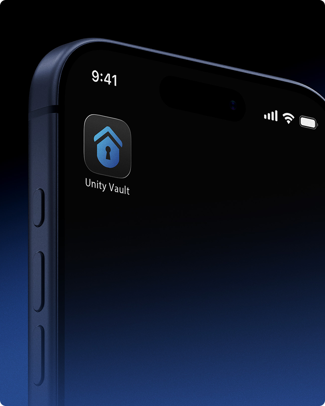
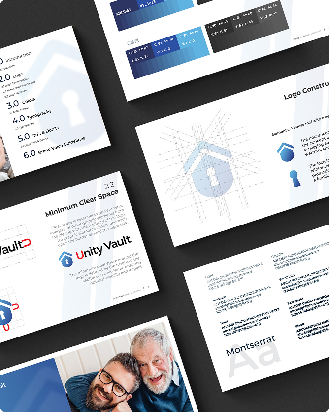
The visual system we developed had to balance security and approachability: Logo: We explored a symbol that combined unity, protection, and intuitive connection, a mark that felt both modern and nurturing. Color palette: Soft, reassuring tones with a palette that conveys calmness, yet confidence. Typography: Rounded yet clean typeface, projecting clarity without rigidity, reinforcing approachability. Iconography & Patterns: I created a simple, meaningful shape that evoke connection, shared responsibility, and trust.
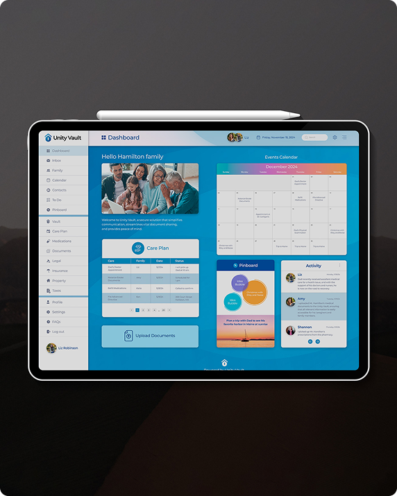
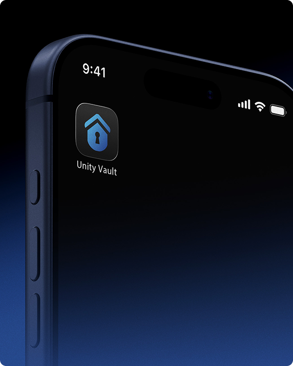
Designing the App UI
With the brand foundations laid, I translated them into a thoughtfully designed application interface: A user interface that prioritizes ease of use, especially for care partners who might not be tech-native. Clear, accessible information architecture for uploading, sharing, and organizing sensitive documents. Visual feedback and micro-interactions that reinforce security and collaboration, so users always feel in control and supported. A UI that feels calm, warm, and trustworthy, aligned tightly with the brand identity.
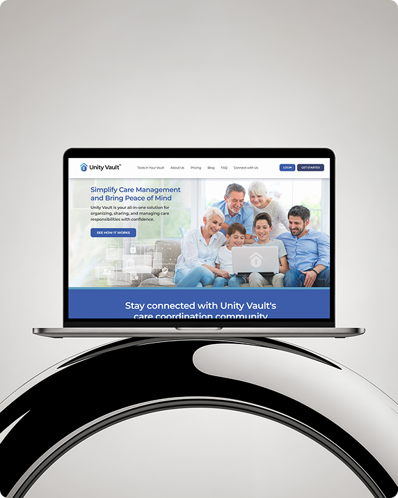
Bringing It All to Life
We built out a full brand ecosystem: Marketing materials (website, launch assets) that speak to both founders and future users. Brand guidelines to ensure consistent implementation across platforms and touchpoints. Design system for the app, allowing for scalable updates, new features, and brand-aligned growth.
Conclusion
A Unified Vision for Care
The result is a cohesive, premium identity that gives UnityVault a powerful presence in the caregiving space. The brand feels deeply human, rooted in empathy, anchored in trust, while the app delivers a polished, intuitive experience. This branding and design foundation has supported UnityVault’s growth into a profitable, impactful company that truly helps care partners connect and manage their shared responsibilities with confidence.
Like what you see?
Let’s work together.
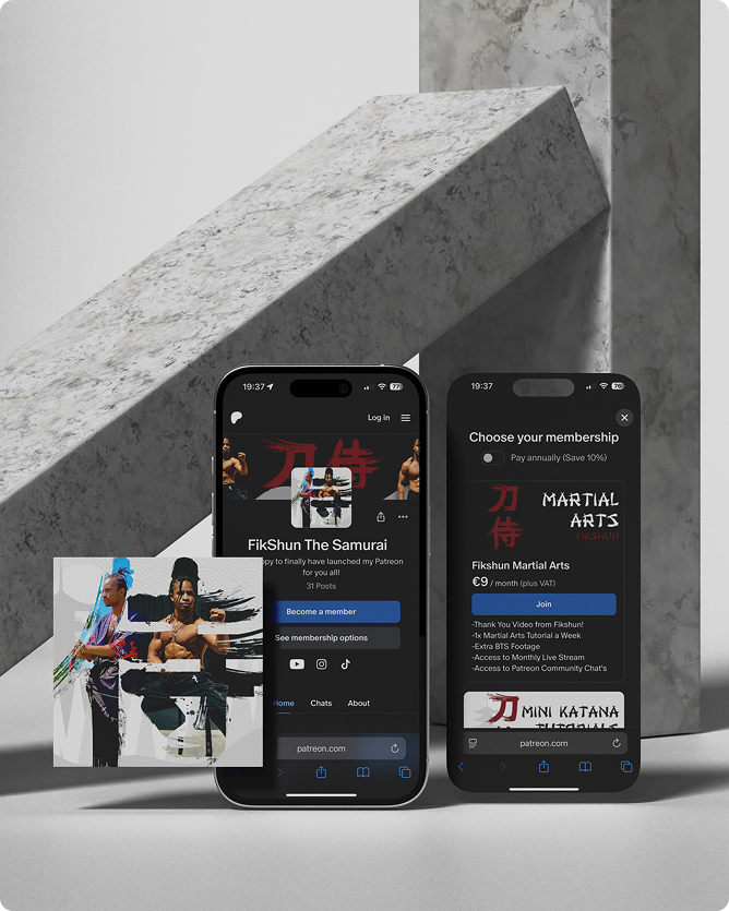
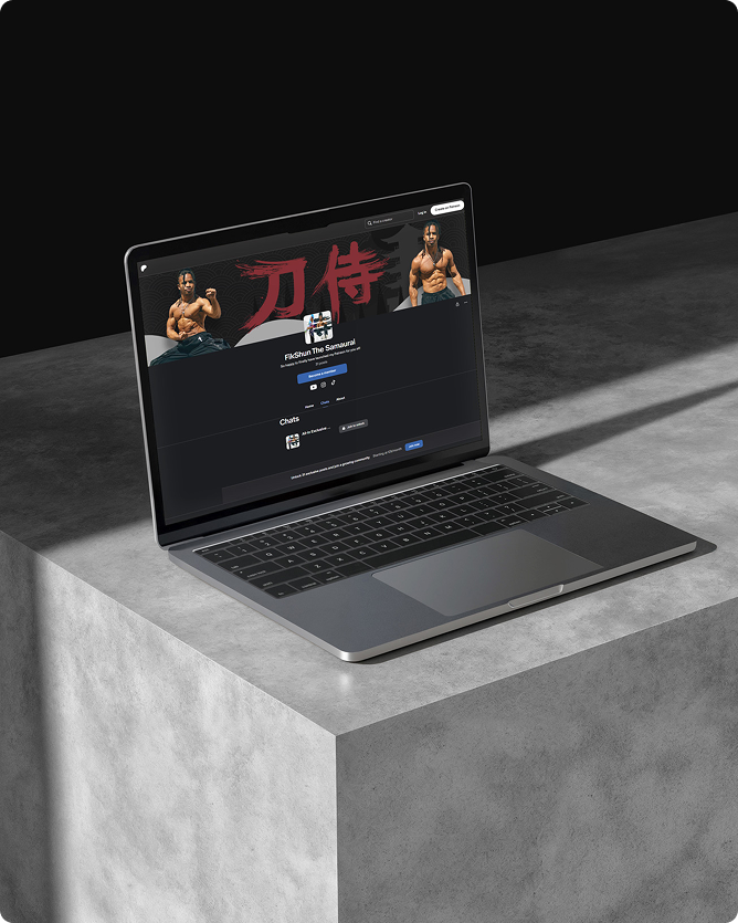
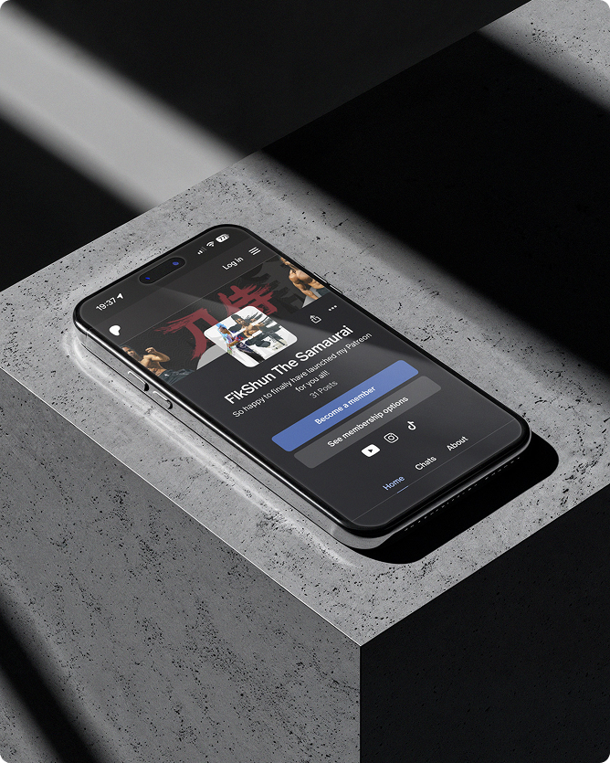
Defining FikShun’s Patreon Presence
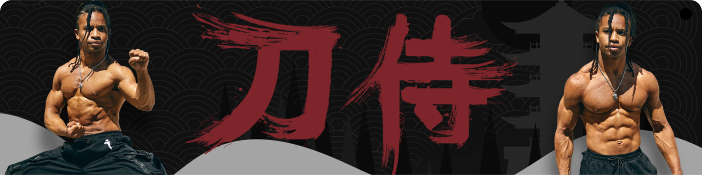
FikShun wanted a Patreon presence that felt as dynamic, disciplined, and creative as his artistry. The goal was to craft a visual identity that captured his dual persona, dancer and martial artist, while giving his fans a polished, immersive experience. I focused on building a style that felt bold, cinematic, and unmistakably “FikShun.”


Designing the Visual Identity System
I created a cohesive set of Patreon assets: a strong profile photo, a cinematic banner, and a unified system of tier thumbnails. Each design balanced movement and precision, using color, composition, and subtle visual motifs inspired by martial arts and performance. The thumbnails clearly distinguished each membership tier while maintaining a consistent, elevated aesthetic across the entire page.
Bringing the Page to Life
Once the visuals were finalized, I delivered everything optimized for Patreon’s formats, ensuring clarity and impact across mobile and desktop. The refreshed identity gave FikShun’s page a professional, high-end look that matched the quality of his content and strengthened the connection with his community.

Conclusion
A Platform Worthy of His Craft
The final visual system elevated FikShun’s Patreon into a polished, cohesive experience that reflects his talent, discipline, and creative energy. With a unified identity and clear tier structure, his page now feels intentional, professional, and perfectly aligned with the artistry his audience supports.
Like what you see?
Let’s work together.

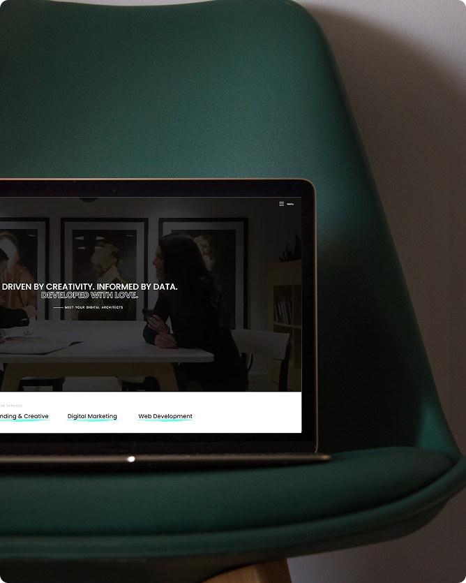
Refining ALX Creatives Digital Presence
ALX Creatives wanted a website and digital assets that reflected their innovative, results-driven approach to marketing. The goal was to streamline their online presence while giving their portfolio a cohesive, professional look. I focused on elevating their visuals and user experience, ensuring every touchpoint felt polished and strategically designed.

Designing for the Agency
I collaborated with ALX Creatives on a wide range of digital designs, from website mockups and banners to marketing assets for both their brand and their clients. Each design balanced creativity with clarity, maintaining a consistent aesthetic across multiple projects while supporting the agency’s diverse campaigns.
Delivering Cohesive, Impactful Designs
All design solutions were optimized for digital use, ensuring clarity, consistency, and engagement. By working closely with the team, I helped bring both the agency’s and their clients’ visions to life, strengthening ALX Creatives’ portfolio and providing polished, professional visuals across every project.

Conclusion
A Unified Digital Presence
The collaboration elevated ALX Creatives online presence and client work alike, creating a cohesive, professional suite of digital assets. Together, we delivered designs that are visually striking, strategically aligned, and perfectly suited to support both the agency and their clients.
Like what you see?
Let’s work together.
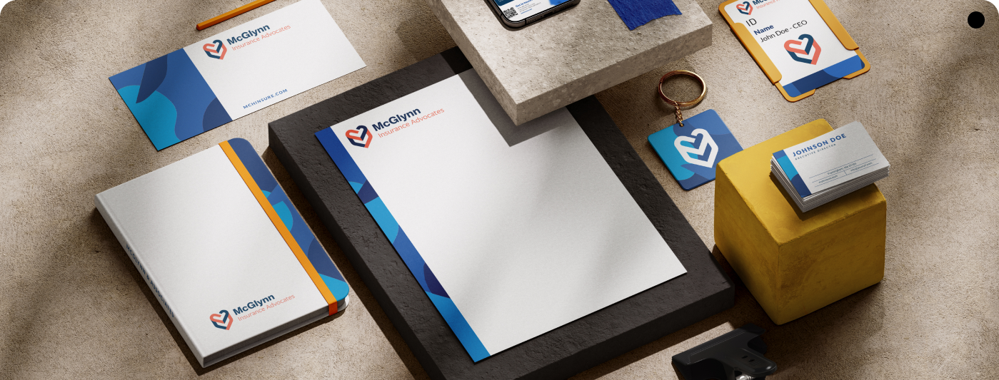
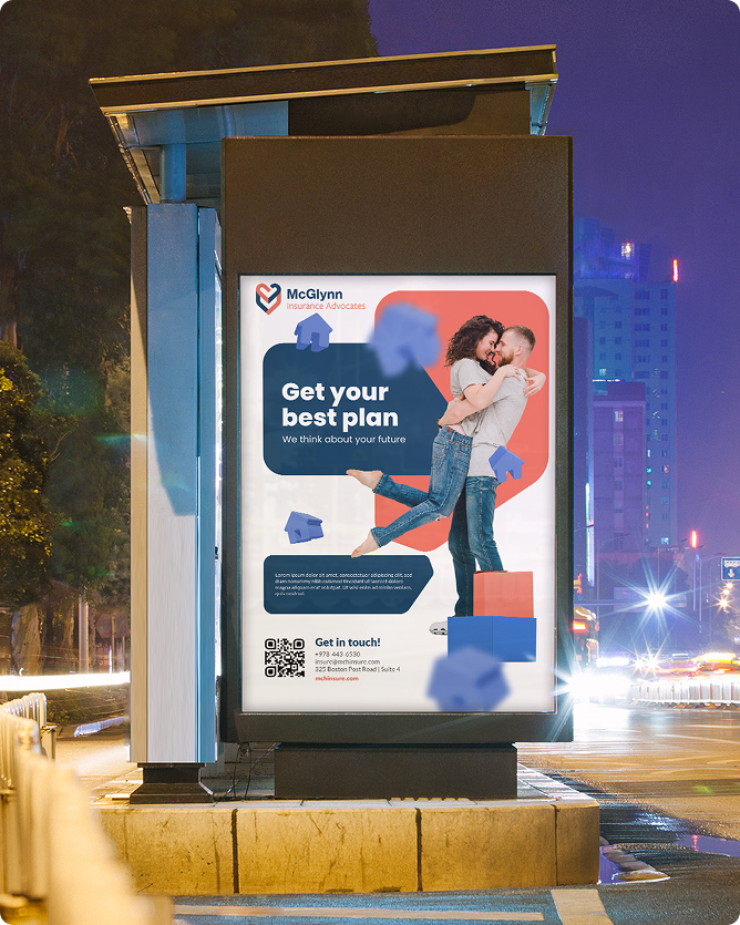
A Legacy of Trust and Expertise
With over a century of service, McGlynn Insurance Advocates has built a reputation rooted in care, reliability, and deep industry knowledge. When they approached me, their goal was clear, to bring this legacy into the 21st century with a modern, refined brand identity that honored their history while positioning them as a forward-thinking leader in insurance services.
Defining the Brand Essence
At the heart of the refresh was McGlynn’s core promise: expert guidance delivered with integrity and personal attention. We defined a brand personality that is professional, approachable, and confident, one that communicates prestige without pretension. This strategic foundation guided every visual and verbal element, ensuring the identity resonated with both longtime clients and new audiences.
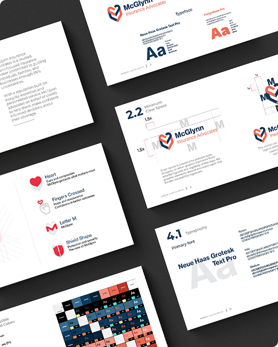
Crafting a Modern Visual Identity
The new identity balances timeless professionalism with contemporary clarity: Logo: A refined mark that nods to McGlynn’s heritage while feeling modern and authoritative. Color Palette: Sophisticated, muted tones that convey trust, stability, and expertise. Typography: Elegant yet approachable typeface that project clarity and confidence. Supporting Elements: Patterns, icons, and textures inspired by the world of insurance and protection, reinforcing reliability and depth.

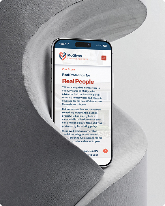
Elevating the Digital Presence
I translated the refreshed brand into a comprehensive online experience: Thoughtful layouts and visuals that communicate professionalism, transparency, and approachability. Digital assets, banners, marketing visuals, and templates, crafted to maintain consistency and reinforce the premium brand image across all channels.
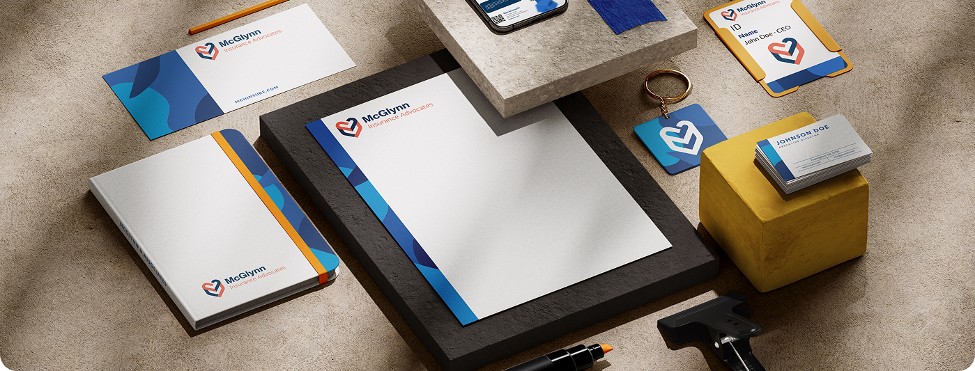
Bringing the Brand to Life
The full ecosystem now reflects McGlynn’s century-long commitment to clients: Cohesive branding across print, digital, and marketing materials. Guidelines and templates to ensure consistent execution across future campaigns and client communications. A visual identity that positions McGlynn Insurance Advocates as a trusted, contemporary leader in insurance, bridging legacy and modern excellence.

Conclusion
Prestige Meets Modern Assurance
The brand refresh elevated McGlynn Insurance Advocates into the modern era without losing the gravitas of their century-long legacy. The identity communicates trust, professionalism, and sophistication, creating a cohesive, high-end presence that supports the agency’s growth, strengthens client confidence, and honors the remarkable history of their service.
Like what you see?
Let’s work together.
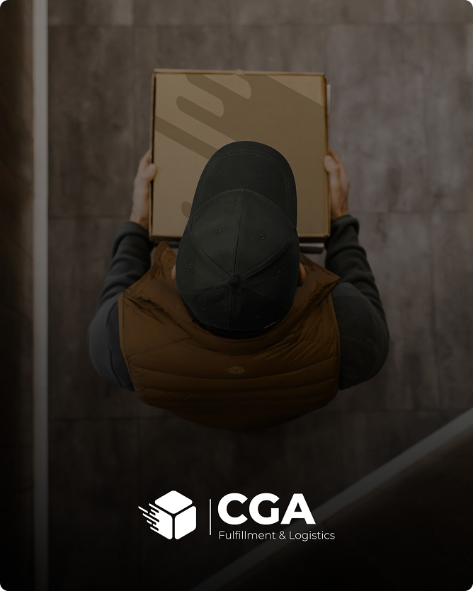
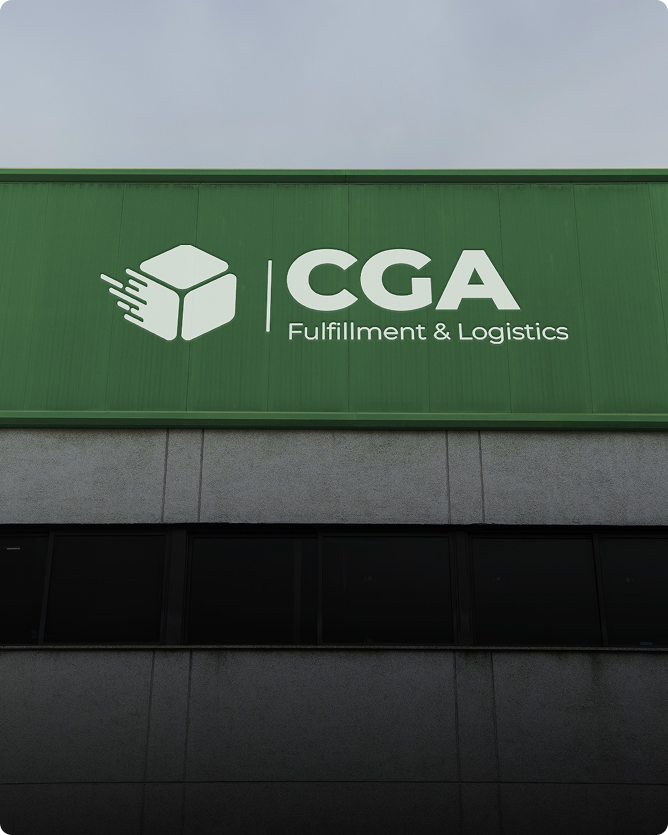
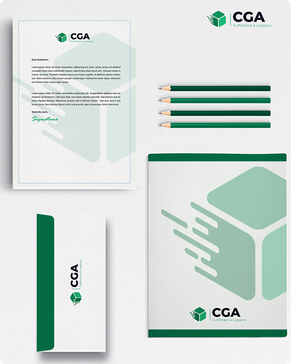
Modernizing a Trusted Logistics Brand
CGA Fulfillment & Logistics provides reliable, end-to-end logistics solutions for a wide range of clients. They wanted a refreshed identity that reflected their efficiency, expertise, and forward-looking approach. The goal was to create a brand that communicates professionalism and trust while standing out in a competitive logistics market.
Crafting a Cohesive Brand Identity
I designed a new logo and visual system that balances strength and clarity: Logo: A bold, modern mark that conveys movement, reliability, and connectivity. Color Palette: Strong, professional tones that signal dependability and efficiency. Typography & Supporting Elements: Clean, legible typefaces paired with subtle graphic motifs that evoke logistics, precision, and streamlined operations.
Bringing the Brand to Life
The refreshed identity was applied across digital and print touchpoints, including business collateral and online assets. The redesign gives CGA a modern, cohesive presence that reinforces their credibility, communicates their logistical expertise, and positions them for continued growth in the industry.
Conclusion
A Brand Built for Scale and Trust
The new visual identity elevates CGA Fulfillment & Logistics, combining professionalism, clarity, and modernity. It reflects their commitment to efficiency and reliability, giving clients confidence in every interaction while strengthening CGA’s competitive presence.
Like what you see?
Let’s work together.
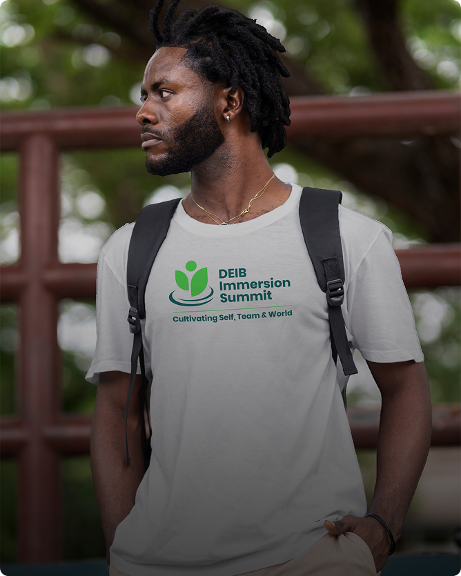
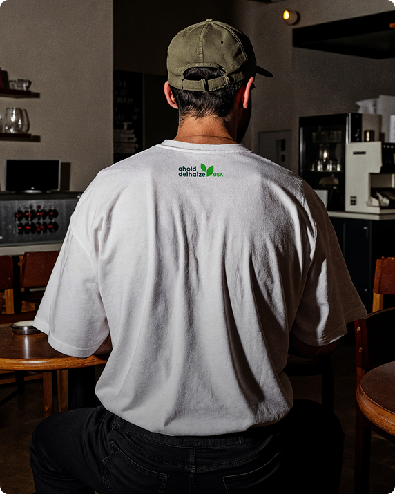
Elevating a Global Brand Experience
For Ahold Delhaize’s DEIB Immersion summit, the goal was to create visuals that were cohesive, polished, and worthy of a global leader in retail, communicating professionalism, energy, and prestige across every touchpoint.
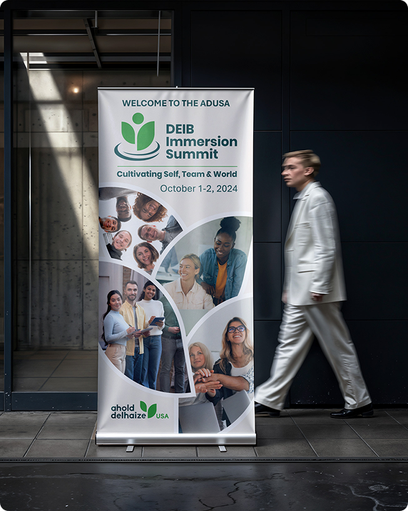

Crafting Premium Summit Collateral
A suite of materials brought the event to life: summit banners, custom T-shirts, and a Microsoft Teams template. Each asset reflected the brand’s authority and scale while remaining visually engaging and cohesive, reinforcing the event’s importance and Ahold Delhaize’s leadership in the industry.
A Cohesive Experience for a Global Brand
All designs were optimized for both digital and physical applications, ensuring clarity, consistency, and impact. The refreshed collateral elevated the summit experience, leaving attendees with a polished, memorable impression of Ahold Delhaize’s brand and organizational excellence.
Conclusion
A Summit Worthy of a Global Retail Leader
The result is a set of premium, high-impact materials that communicate prestige, professionalism, and meticulous attention to detail, a brand experience befitting Ahold Delhaize’s global stature.
Like what you see?
Let’s work together.
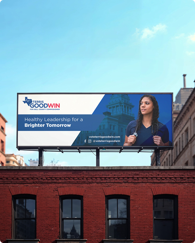
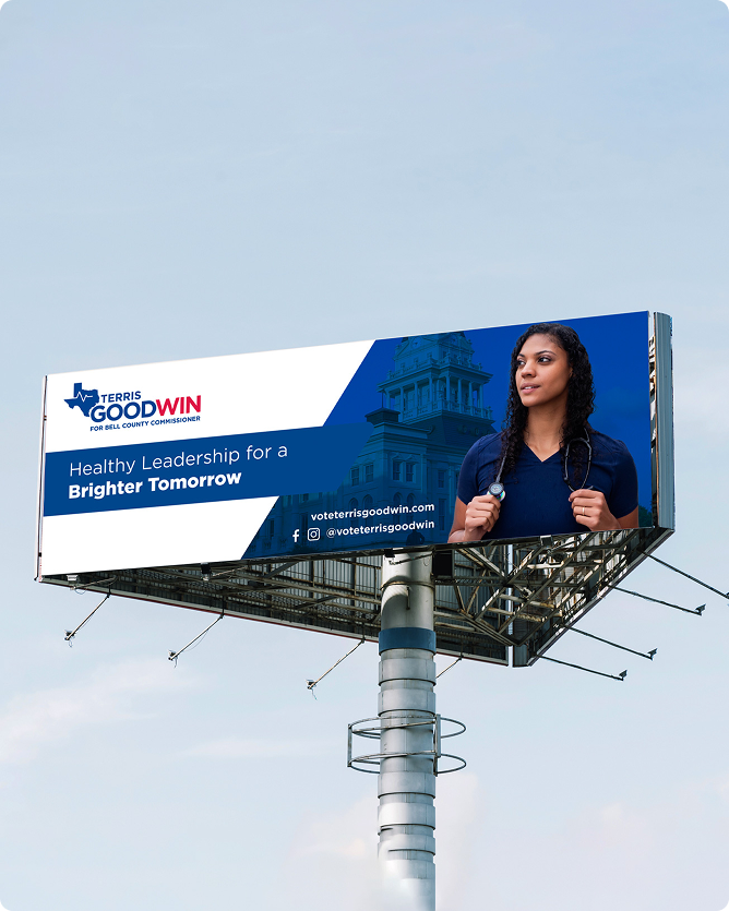
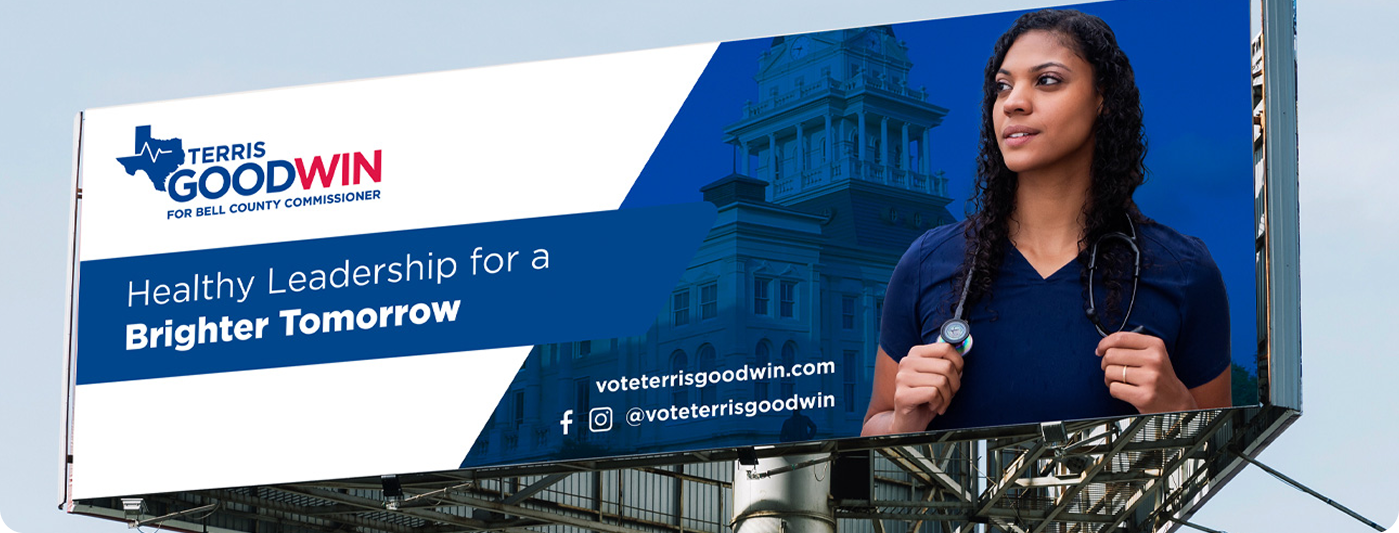
Designing a Bold Campaign Identity
Terris Goodwin’s run for Bell County Commissioner called for visuals that were confident, memorable, and attention-grabbing. The goal was to craft a visual identity that reflected her leadership, approachability, and commitment to the community.
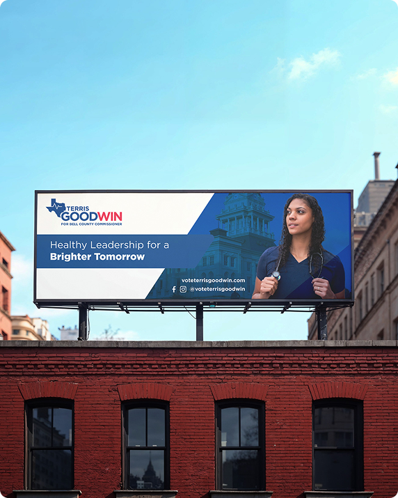

Creating Impactful Billboard Campaigns
I designed a series of billboards that clearly communicated her message and resonated with local voters. Each layout combined strong typography, bold color, and concise messaging to maximize visibility and engagement.
Strengthening Community Presence
The campaign assets were optimized for both scale and clarity, ensuring high impact across public spaces. The refreshed visuals elevated Terris Goodwin’s public profile, making her message clear, professional, and instantly recognizable.
Conclusion
A Campaign That Stands Out
The final billboard campaign captured Terris Goodwin’s leadership and energy, delivering a professional, high-visibility presence that effectively connected with the community and reinforced her candidacy.
Like what you see?
Let’s work together.
© 2025 Vance D. All rights reserved.
Let’s connect arrow_right_alt Instagram LinkedIn
Let’s connect arrow_right_alt Instagram LinkedIn
© 2025 Vance D. All rights reserved.